Enterprise UX · Google

Case Study

Google — Enterprise Settings Redesign

Designing a scalable Settings framework — proven by shipping Notifications first.

Role: Design Sprint Facilitator · Notifications MVP OwnerScope: MVP + Framework + LibraryType: Enterprise Settings Platform

Quick Glance

  • 🔍 Problem: Enterprise users had no consistent way to manage settings across products — leading to noisy notifications, lost configurations, and frustrated power users.
  • 👤 My Role: Design Sprint Facilitator and Notifications MVP Owner — end to end from competitive research through production-ready components.
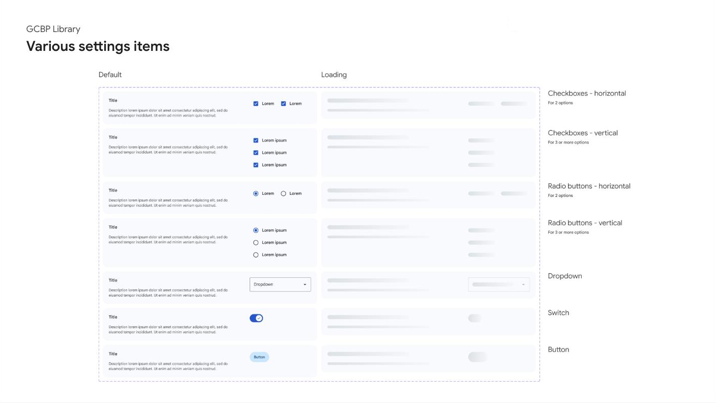
  • ✅ Result: 15 reusable component templates published org-wide. Notifications MVP shipped across the full entry-to-error-state flow across 11 screens.
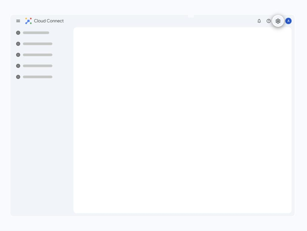
The Problem

A place people visit once — and need to trust.

Settings is a place people visit once and then forget — until something breaks or a notification won't stop. When users finally go in, it's usually because the system is talking to them too much, too little, or in the wrong place. For an enterprise product, that friction multiplies fast: more products, more channels, more ways for the experience to feel noisy and inconsistent. The challenge was to make Settings — starting with Notifications — somewhere people could go once, make a confident change, and trust it stuck.

My Role

Facilitator, owner, pattern-setter.

I facilitated the design sprint for this work, driving the direction from problem framing through the MVP and the future vision. I owned the Notifications experience end to end and shaped the reusable pattern that came out of it.

Approach

Learn from the field, then scope tight.

I started with a competitive analysis across 13+ enterprise products to learn how mature settings experiences are structured. Patterns that worked — like Salesforce/Vector's top-bar entry into a full-page settings view, a left-hand tree for navigation, and search to cut through depth — informed the framework. Anti-patterns I wanted to avoid were just as instructive: another product buried settings behind a 3-dot menu with inconsistent labels and no global home. From there I scoped the MVP down to one tab people actually struggle with: Notifications.
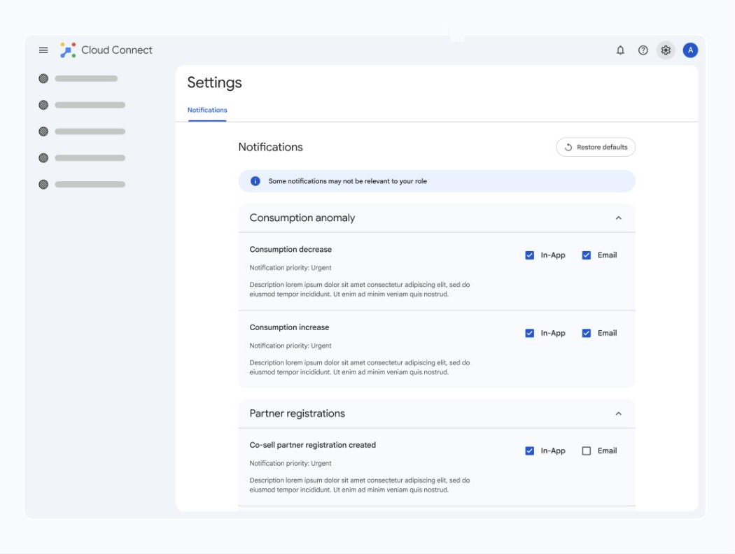
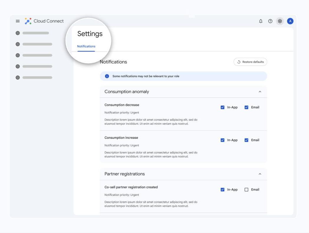
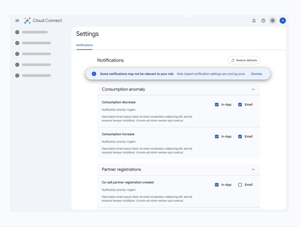
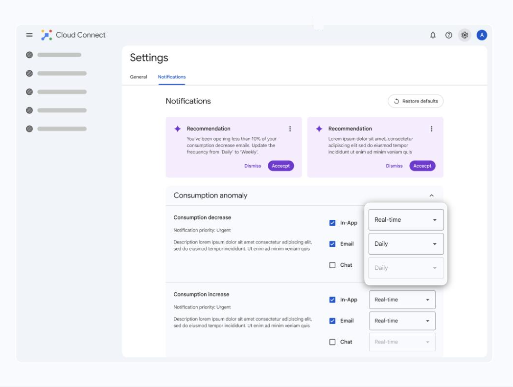
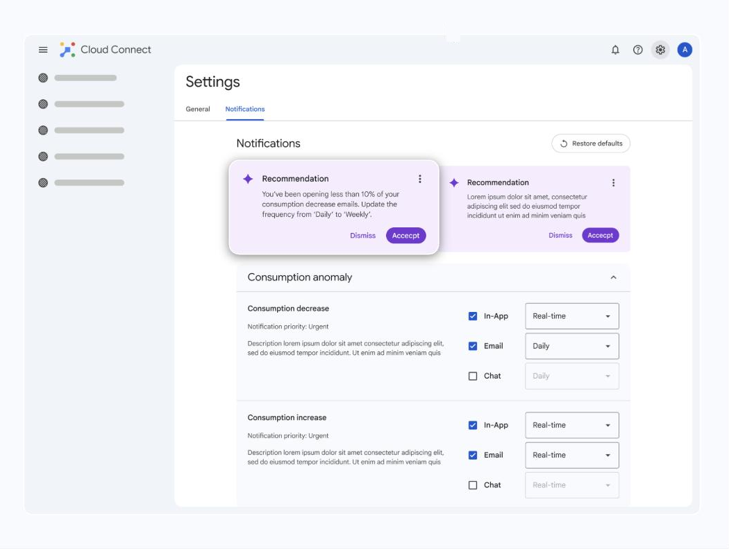
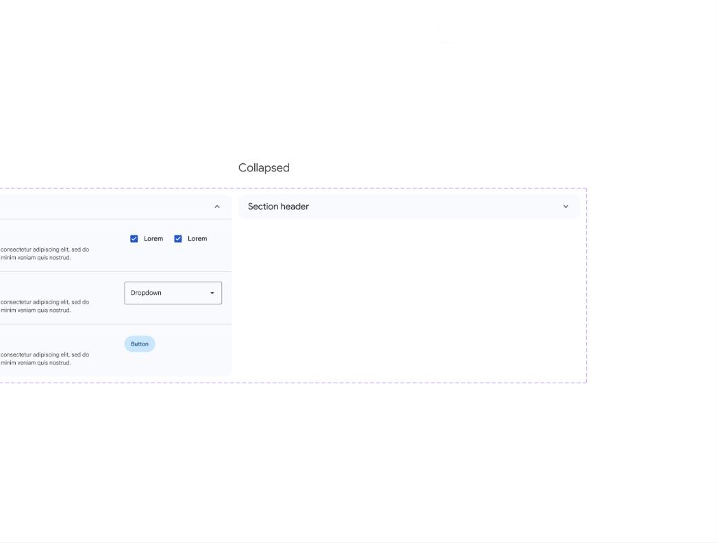
MVP Design

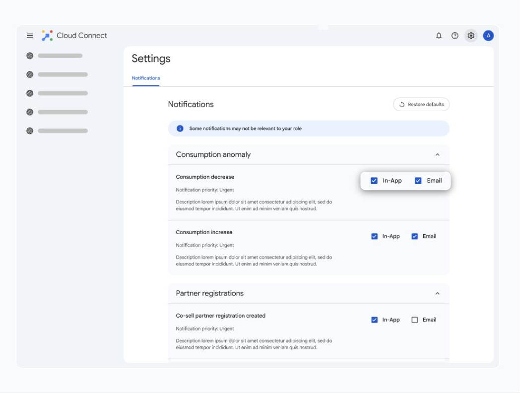
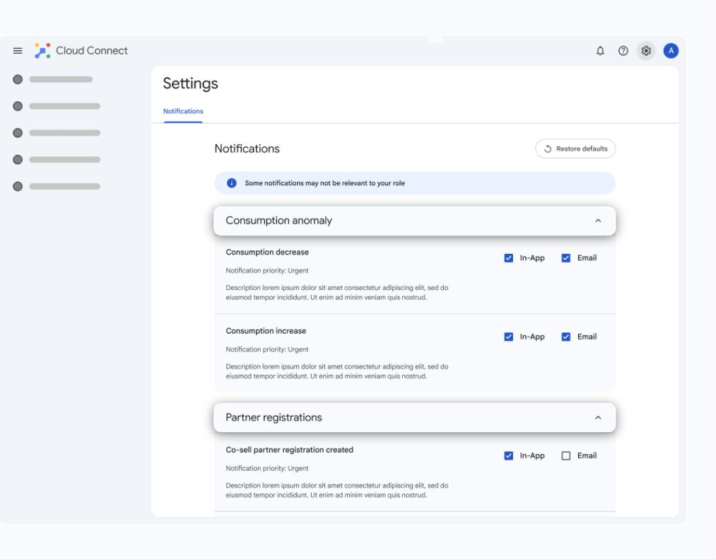
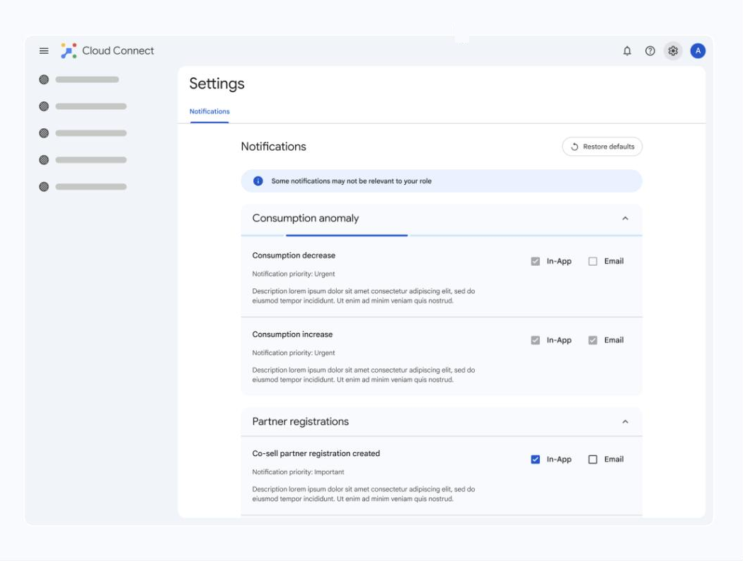
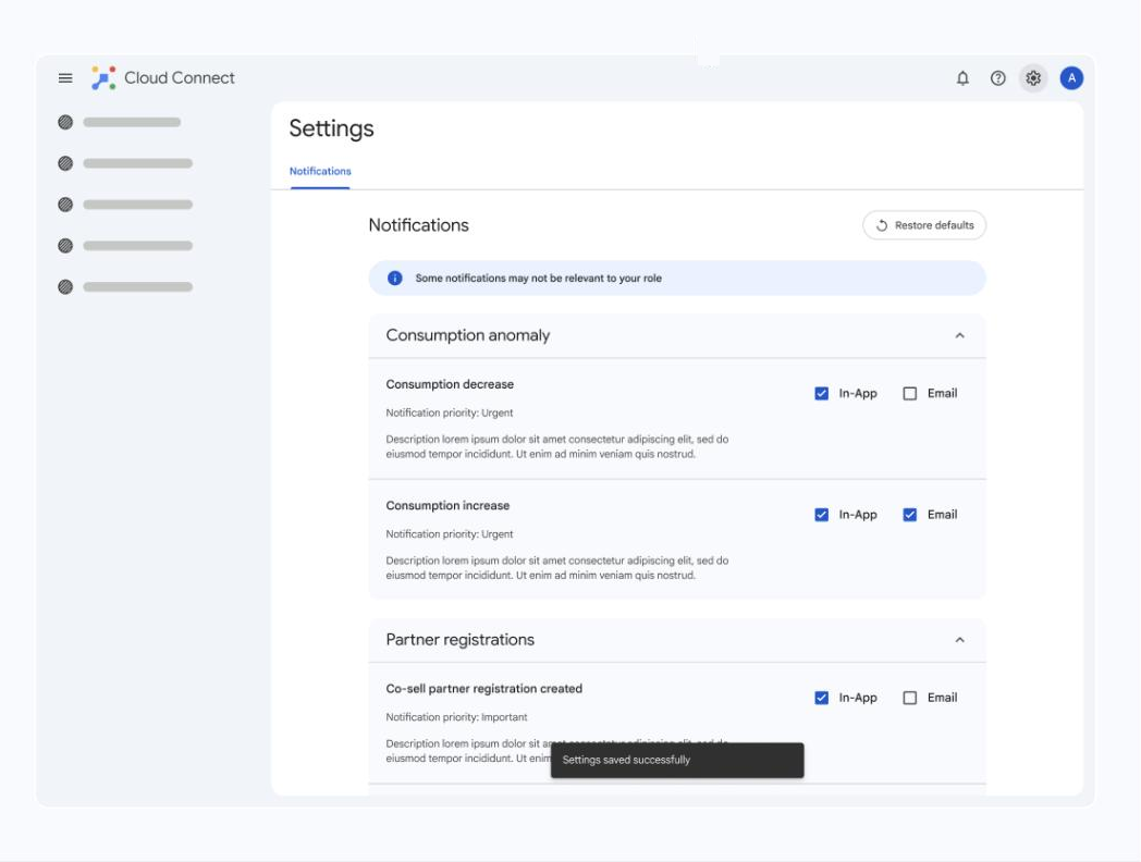
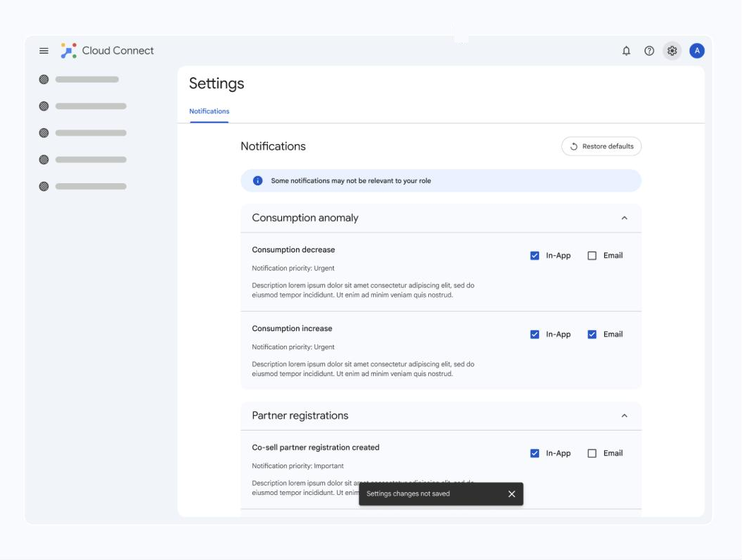
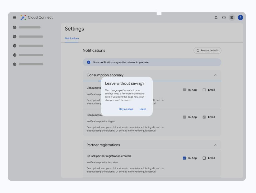
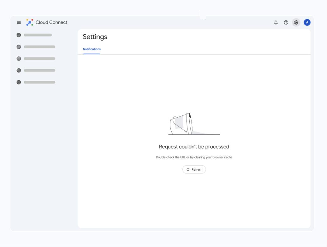
Shipping Notifications First

Eleven screens that take Notifications from entry point to error state — each one a deliberate moment of clarity, control, or confirmation.

Top bar entry point — One clear door into Settings from the top bar, so people don't have to hunt for it.
1) Top bar entry point — One clear door into Settings from the top bar, so people don't have to hunt for it.
Full-page view — Settings opens as its own full page, not a cramped panel — room to actually see your options.
2) Full-page view — Settings opens as its own full page, not a cramped panel — room to actually see your options.
The Notifications tab — The MVP zeroes in on Notifications, the one tab people open when the product is talking too much or too little.
3) The Notifications tab — The MVP zeroes in on Notifications, the one tab people open when the product is talking too much or too little.
Info banner — A short banner sets context up front so the first visit isn't confusing.
4) Info banner — A short banner sets context up front so the first visit isn't confusing.
Notification channel settings — Control each channel separately, so email, in-product, and the rest don't all behave the same way.
5) Notification channel settings — Control each channel separately, so email, in-product, and the rest don't all behave the same way.
Grouping & digest — Settings are grouped by category with a digest view, so related controls live together instead of scattered.
6) Grouping & digest — Settings are grouped by category with a digest view, so related controls live together instead of scattered.
Auto-save — Changes save as you make them — no hunting for a save button.
7) Auto-save — Changes save as you make them — no hunting for a save button.
Successfully saved — Clear confirmation that the change stuck, so you can leave with confidence.
8) Successfully saved — Clear confirmation that the change stuck, so you can leave with confidence.
Not saved — When something doesn't save, the system says so plainly instead of failing silently.
9) Not saved — When something doesn't save, the system says so plainly instead of failing silently.
Leave without saving — A gentle check before you walk away from unsaved changes.
10) Leave without saving — A gentle check before you walk away from unsaved changes.
Error state — When something breaks, the error is honest and tells you what to do next.
11) Error state — When something breaks, the error is honest and tells you what to do next.

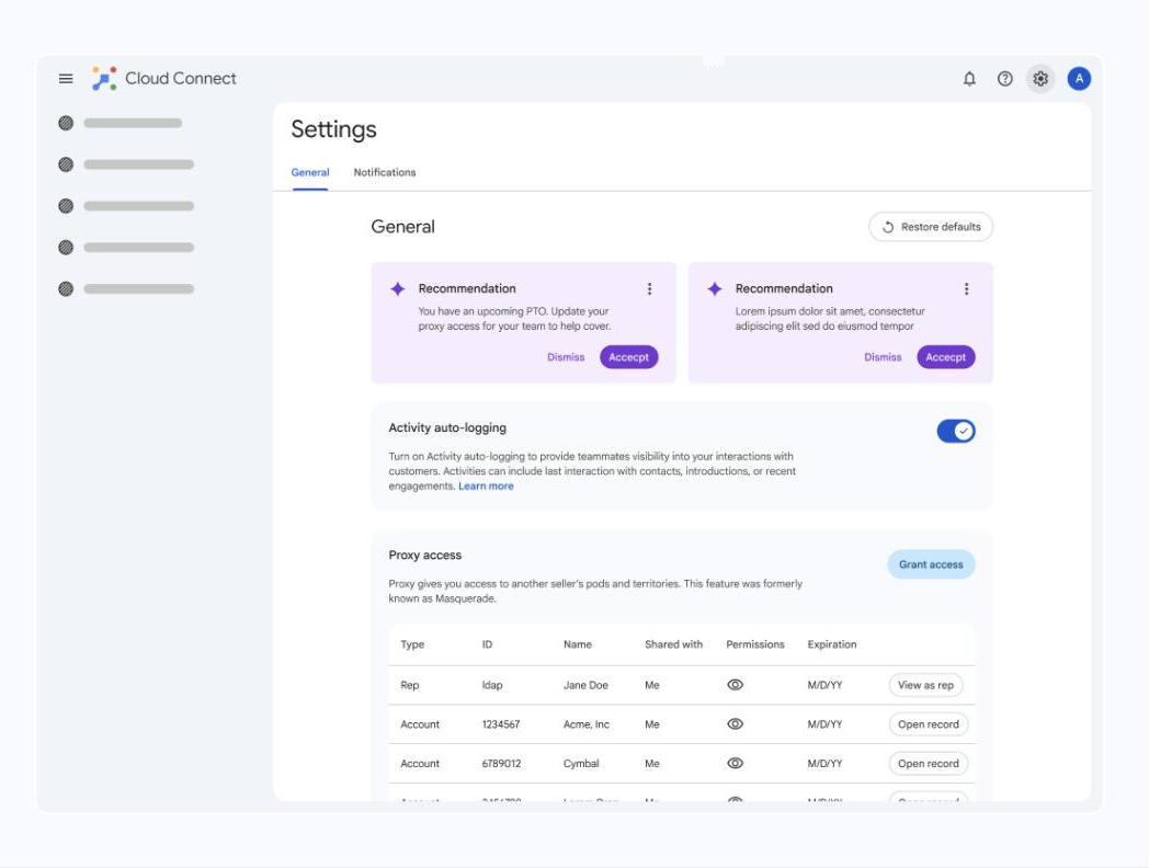
Future Vision / Roadmap

Where the framework goes next.

Notifications was the proving ground. The roadmap extends the same pattern across General settings, deeper notification controls, and AI-suggested defaults.

General settings — The framework scales beyond Notifications — General is the next tab to slot in.
12) General settings — The framework scales beyond Notifications — General is the next tab to slot in.
More notification depth — Future depth like chat controls and frequency, so people tune how often they hear from the product.
13) More notification depth — Future depth like chat controls and frequency, so people tune how often they hear from the product.
AI recommendations — Eventually the system suggests smart defaults, so you don't have to manage every toggle yourself.
14) AI recommendations — Eventually the system suggests smart defaults, so you don't have to manage every toggle yourself.

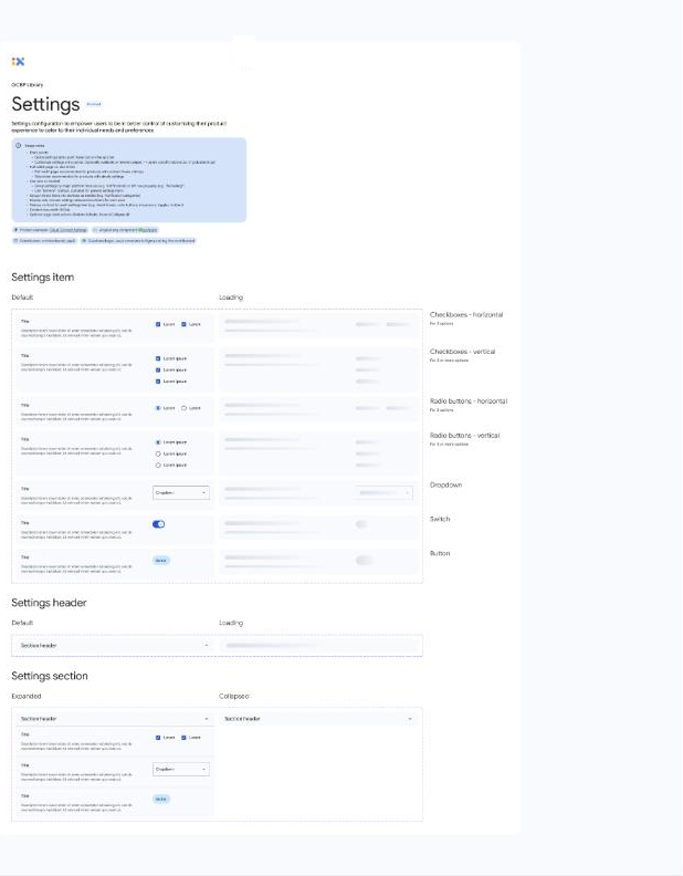
Impact — Google Design System Library

A pattern other teams can build on.

The Settings work was published into Google's internal design system library as a reusable pattern — components, headers, and section behaviors that any product team can pick up.

Scalable design pattern — The Settings work became a reusable pattern other teams can build on, not a one-off screen.
15) Scalable design pattern — The Settings work became a reusable pattern other teams can build on, not a one-off screen.
Component variants — A library of settings items covering the real states teams need.
16) Component variants — A library of settings items covering the real states teams need.
Section headers — Consistent headers so every product's settings read the same way.
17) Section headers — Consistent headers so every product's settings read the same way.
Sections (expanded / collapsed) — Flexible sections that expand and collapse to keep long settings pages manageable.
18) Sections (expanded / collapsed) — Flexible sections that expand and collapse to keep long settings pages manageable.
15
Reusable Component Templates
13+
Enterprise Products Researched
1
Unified Design Pattern Published Org-Wide

Interested in a deeper dive? I am happy to walk through the full project documentation in a conversation.