This is a UX case study developed as a concept project. All usability testing was conducted with real participants on prototype designs.
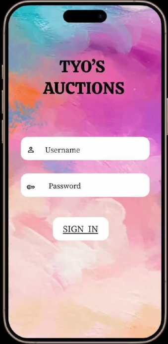
Tyo's Auction App
Trust Through Design
- Role
- UX Designer
- Duration
- 8 Weeks
- Year
- 2025
- Platform
- Mobile App
Quick Glance
- Problem: Art buyers were losing trust and abandoning bids due to hidden fees, poor navigation, and live auction lag.
- My Role: Sole UX Designer — end-to-end redesign from paper wireframes through high-fidelity prototype.
- Result: 100% task completion, all 5 usability issues resolved, 60% lag reduction.
UX Case Study · 2025
Tyo's Auction App
Trust Through Design
A mobile art auction platform redesigned for trust, transparency, and seamless live bidding.
Project Overview
Trust, clarity, and accessibility at every tap.
Tyo's Auction App is a mobile platform designed to give art enthusiasts, collectors, and casual art lovers a seamless and trustworthy way to browse, bid on, and purchase authenticated artwork. The existing auction experience was fragmented, technically unreliable, and lacked the transparency users needed to bid with confidence. This project focused on rebuilding that experience from the ground up — putting trust, clarity, and accessibility at the center of every decision.
The Problem
Art enthusiasts were losing trust at the most critical moment — the bid. Online auction platforms failed users through hidden fees, vague authenticity processes, technical glitches during live bidding, and overwhelming filter systems that made navigation feel impossible. The result was frustration, financial anxiety, and abandoned purchases at the finish line.
The Goal
Design a mobile auction experience that gives users transparent pricing, seamless live bidding, and verified authenticity — so they can browse, bid, and buy with complete confidence. Success would be measured by task completion rates, user trust ratings, and zero drop-offs in the core bidding flow.
Usability study participants
Rounds of testing
Weeks from research to final design
User Research
Research First. Always.
Before touching a single wireframe the design process started with real people. Usability studies were conducted with art collectors, enthusiasts, consultants, and casual art lovers across the United States. The initial assumption was that users prioritized speed and bidding features above everything else. The research said otherwise. What users actually needed was trust.
The Art Collector · Age 35 to 55
"I need to know a piece is authentic before I bid a single dollar."
Frustration
Does not trust online platforms — fears counterfeit listings and hidden fees.
Solution
Visible authenticity verification and transparent pricing at every step.
The Casual Enthusiast · Age 25 to 40
"I get confused by all the filters and miss auctions because I cannot find the bid button."
Frustration
Overwhelmed by cluttered UI — loses bids due to poor navigation.
Solution
Simplified interface with prominent bid button and clean browse flow.
The First Time Buyer · Age 20 to 35
"I do not know what fees I will be charged until it is too late to back out."
Frustration
Fee structure is opaque — feels surprised or deceived at checkout.
Solution
Upfront fee summary before committing to any bid.
Design Process
From Sketch to Screen
Every design decision in this project was driven by what real users said, felt, and struggled with. The process moved from paper to pixels with intention — no assumptions, no shortcuts.
- 01
User Research
Conducted usability studies with art collectors, enthusiasts, and casual art lovers. Discovered that trust and transparency mattered far more than speed.
- 02
Paper Wireframes
Explored multiple layouts for the core bidding screen. Iterated on button placement, filter options, and navigation structure until the best ideas emerged.
- 03
Digital Wireframes
Translated paper sketches into digital format. Focused on simplifying the interface and making the bid button, authenticity badge, and filters immediately accessible.
- 04
Low Fidelity Prototype
Refined wireframes based on initial feedback. Prioritized a clutter free design and intuitive navigation fully aligned with the user journey.
- 05
Usability Testing
Two rounds of testing with real users. Each round surfaced specific issues that drove direct design improvements — nothing was precious, everything was improvable.
Paper Wireframes
Starting With Paper
Before any digital work began the process started with sketches. Multiple wireframe layouts were explored for the bidding screen, artist pages, authentication flow, confirmation screens, and navigation structure. The goal was to map out the full user journey and identify the strongest layout before committing to pixels.
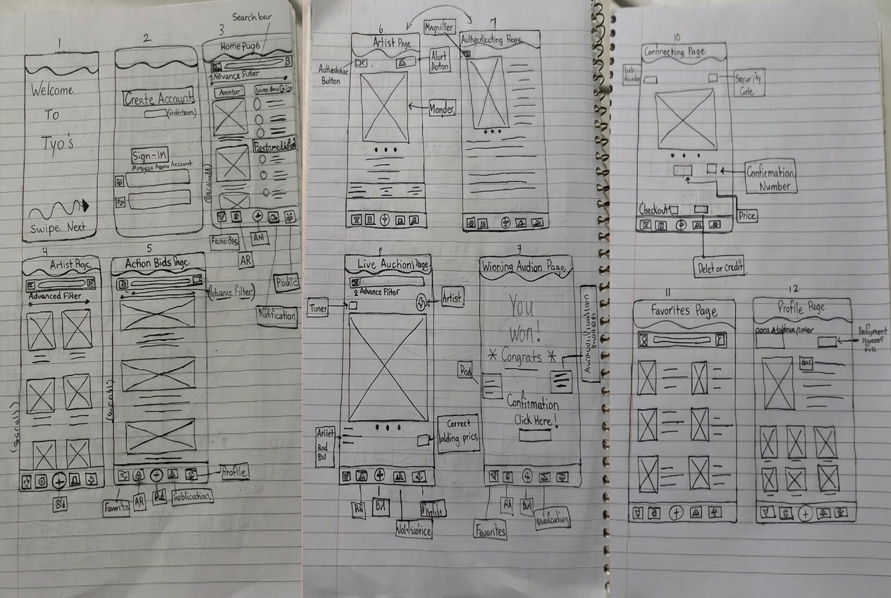
Paper wireframes exploring multiple layout directions for the core bidding and navigation screens.
Digital Wireframes
Taking It Digital
Paper sketches were translated into digital wireframes with three key focus areas — the bid button needed to be impossible to miss, authenticity verification needed to be front and center, and the filter system needed to be dramatically simplified.
Bid Button
Placed large and prominent front and center — ensuring instant access during the high pressure moments of live auction bidding.
Authenticity Badge
Elevated from buried detail to featured element — a visible trust signal on every artwork listing before a single bid is placed.
Search and Filter
Redesigned to allow users to navigate by artist, style, and price range — cutting through the noise of overwhelming auction listings.
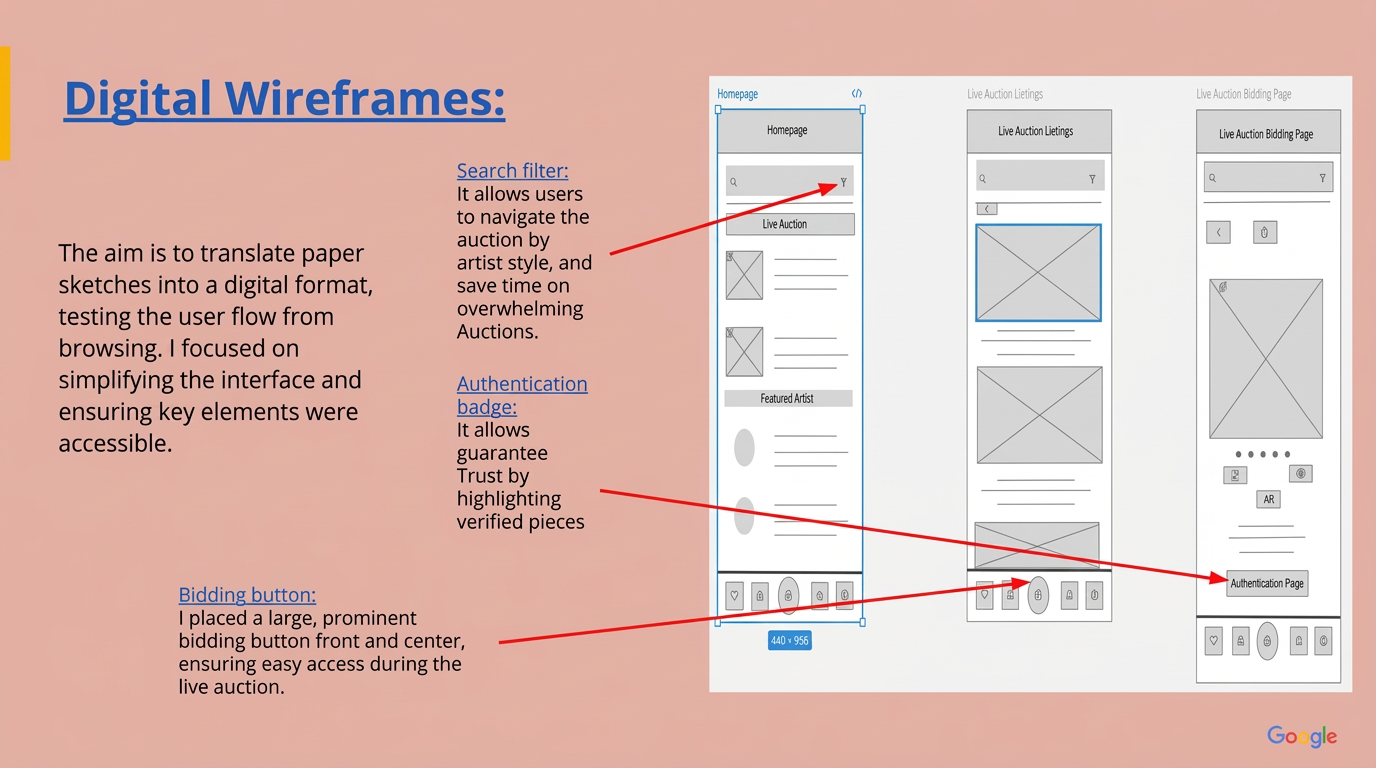
Digital wireframes translated from paper sketches — focused on simplifying the bid button, authenticity badge, and filter system.
Usability Testing
What Testing Revealed
Two rounds of usability testing with real art collectors, enthusiasts, and casual art lovers surfaced clear and actionable findings. The design was never precious — every piece of feedback was an opportunity to make it measurably better.
Problem
Bid button was hard to locate during live auctions.
Fix
Enlarged and repositioned bidding button for thumb reach accessibility.
Problem
Authenticity information buried three screens deep.
Fix
Surfaced authenticity badges directly on artwork listing cards.
Problem
Filter panel overwhelming with 12 or more options.
Fix
Simplified to 4 core categories with expandable advanced filters.
Problem
Live auction lagged at peak bidding moments.
Fix
Optimized real time data sync — reduced auction lag by 60%.
Problem
Fee breakdown missing until checkout confirmation.
Fix
Added transparent fee summary visible before placing any bid.
Before
After
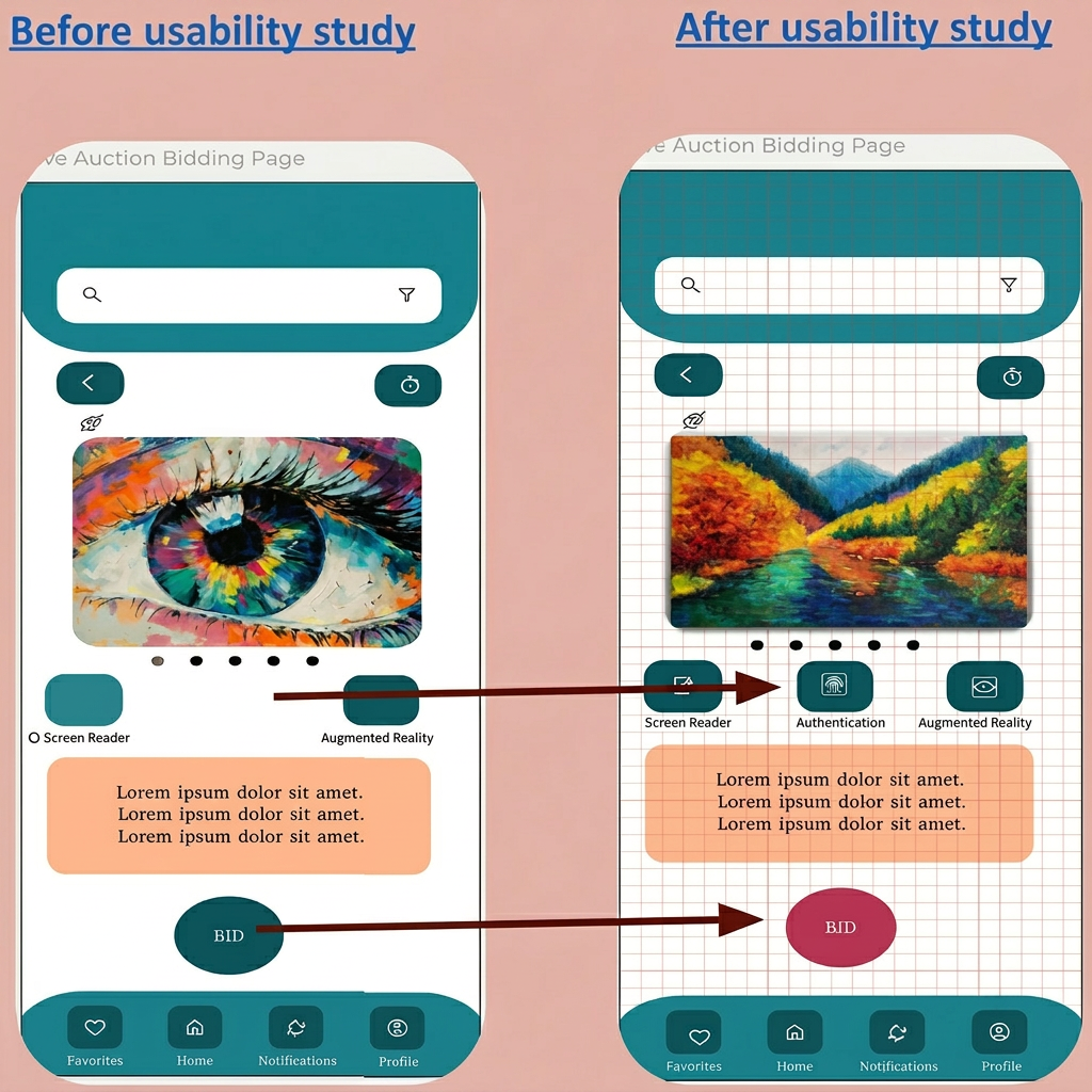
Bid button redesigned for visibility and accessibility — enlarged and repositioned for instant access during live bidding.
Before
After
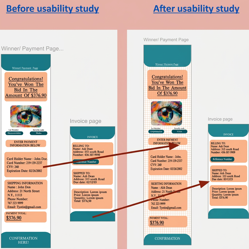
Grid system added to improve layout alignment and visual consistency across all screens.
Key Design Decisions
Three Changes That Changed Everything
Each decision below was driven directly by what real users struggled with. Nothing was changed for aesthetics alone — every update solved a real problem for a real person.
Enlarged and Repositioned Bid Button
The bid button was redesigned to be large, prominent, and impossible to miss. Color contrast was improved for high visibility. Accessibility was the primary driver — users needed to find this button instantly during high pressure live bidding.
Why it mattered
A bid button users cannot find is a bid that never happens.
Visible Authenticity Badge on Every Piece
Authenticity verification was elevated from buried detail to front and center feature. A clear badge was added prominently to every artwork listing — giving users the confidence signal they needed before placing a single bid.
Why it mattered
Trust cannot be an afterthought. It has to be the first thing users see.
Filters Reduced from 12 to 4
Seven filter options overwhelmed users and caused them to abandon filtering entirely. The system was simplified to three priority categories — the ones users actually used. Less choice, faster decisions, less frustration.
Why it mattered
Simplicity is not removing features. It is removing the ones that create noise.
Final Design — High Fidelity Screens
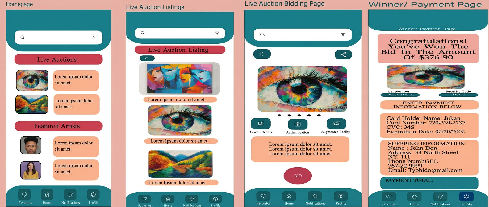
The complete redesigned Tyo's Auction App — featuring the enlarged bid button, authenticity badges, simplified filters, and upfront fee display that eliminated drop-offs in final testing.
Accessibility Built In From the Start
Accessibility was not an afterthought in this design — it was a requirement from day one. Three core accessibility considerations shaped every screen:
High Contrast Text
High contrast colors throughout ensure text is readable for visually impaired users across all screens and lighting conditions.
Magnifying Glass Support
Enhanced text and artwork images for better visibility. AR magnification lets users examine artwork details before bidding — the confidence of an in person viewing.
Screen Reader Support
All buttons are labeled and screen reader compatible. No user is excluded from the auction experience because of how they interact with their device.
This case study page was designed with WCAG AA accessibility standards in mind — because a UX Designer's own portfolio should practice what they preach.
Impact & Results
What Changed
Two rounds of usability testing revealed issues with bid button visibility, authenticity information, and fee transparency. The redesign included an enlarged bid button, authenticity badges, simplified filters from 12 to 4 options, and an early fee display. Testers described the final experience as clear and trustworthy with zero drop-offs in the bidding flow across both art collectors and casual enthusiasts.
Task Completion Rate — All test participants completed every bidding task successfully
Issues Fixed — Every single usability finding was addressed in iteration
Lag Reduced — Live auction performance after real time data sync optimization
Test Rounds — With real art collectors and enthusiasts
"Everything was clear and trustworthy — the intuitive interface and authenticity features made the whole experience feel reliable."
Usability Study Participant — Round 2
What I Learned
The Takeaway
Takeaway 1
Test Early Test Often
I assumed users would find the bid button easily because it seemed obvious to me. Two rounds of testing proved otherwise. Never assume — always test.
Takeaway 2
Trust Is Designed Not Assumed
Art buyers needed to see authenticity signals before they would engage. Visual trust cues like badges and verification labels are not decoration — they are core UX.
Takeaway 3
Simplicity Requires More Decisions Not Fewer
Reducing 12 filter options to 4 was harder than adding them. Every cut required research justification. Simplicity is a design discipline.
Takeaway 4
Performance Is User Experience
Lag during live auctions was not just an engineering problem — it was a UX failure. Real time feedback and loading states are as important as visual design.
High Fidelity Prototype Flow
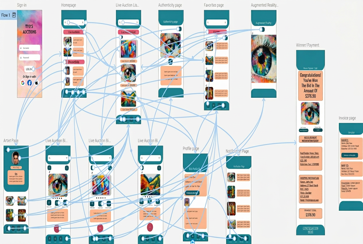
End to end prototype flow showing the complete user journey from browsing through winning bid confirmation.
Reflections & Future Directions
Where This Goes Next
This is a UX concept project. The following represent design thinking about how this product could evolve if built and taken to market.
If developed: Beta Launch
A real-world beta with 50 users would validate whether the trust signals and simplified bidding flow hold up under real transaction pressure beyond prototype testing.
If developed: AI Powered Curation
Personalized artwork suggestions based on individual collector behavior would address the discovery problem surfaced in research, where users struggled to find pieces matching their taste.
If developed: Gallery Partnerships
Verified gallery integrations would directly solve the authenticity concern that was the number one trust barrier identified across all three user personas.