NaviLearn: Bridging the Academic Digital Divide
An Accessible Research Tool Designed for the Non-Tech Native
Quick Glance
- Problem: Adults aged 18–70 were abandoning a 9-step learning flow due to complexity and accessibility gaps.
- My Role: Sole UX Designer — research, information architecture, wireframing, testing, and final UI.
- Result: Core flow reduced from 9 steps to 4. Zero task abandonment in final usability testing.
Prototype Outcomes
Measured in usability testing on the prototype — not live business metrics.
The Goal
Technology Resources in Your Hands
Adults aged 18 to 70 — retirees, gig workers, ESL learners, and career-changers — are trying to teach themselves practical, self-directed subjects: GED prep, digital literacy, ESL, basic math and reading refreshers, and job-skill tutorials pulled from open online resources.
The problem is not motivation. It is that the tools built to help them assume a level of tech fluency they do not have. Users abandon multi-step flows before finishing a single lesson. The digital divide here is not about hardware access — it is about software complexity.
This was academic research: NaviLearn began as a self-directed capstone project, so the study was run for learning rather than for a client or a product roadmap. Participants were recruited from my own community — adult learners, retirees, and gig workers — rather than from a company's user panel, and the findings were used to prove out an accessibility-first design approach instead of validating a commercial release.
Research
What Research Actually Revealed
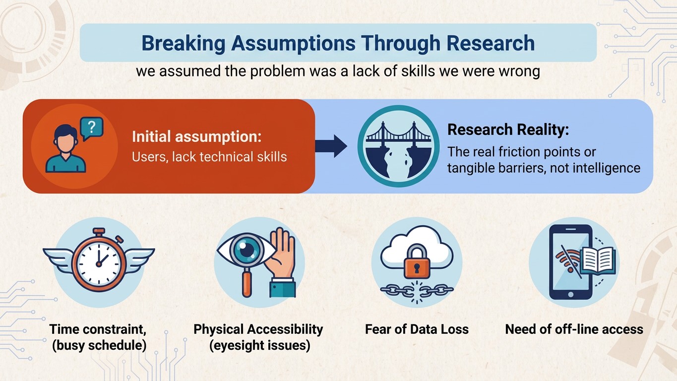
Four tangible barriers emerged from research — not a lack of intelligence, but real friction users encounter every day:
- Time constraints. Users juggling work, caregiving, and study had no patience for multi-step flows.
- Physical accessibility. Visual impairments, motor limitations, and small touch targets blocked usage.
- Data loss fear. Users avoided trying features because past apps had lost their progress without warning.
- Offline access. Unreliable Wi-Fi meant learning had to keep working without a connection.
Why a Mobile App, Not a Website
Research surfaced that the target users — gig workers, retirees, ESL learners — primarily access the internet through phones, often without reliable Wi-Fi. A native app made offline downloads, voice input, and one-tap accessibility tools possible in ways a responsive website could not reliably deliver. Mobile-first was not aesthetic — it matched how this audience actually lives online.
Process
Starting With Structure: Paper Wireframes
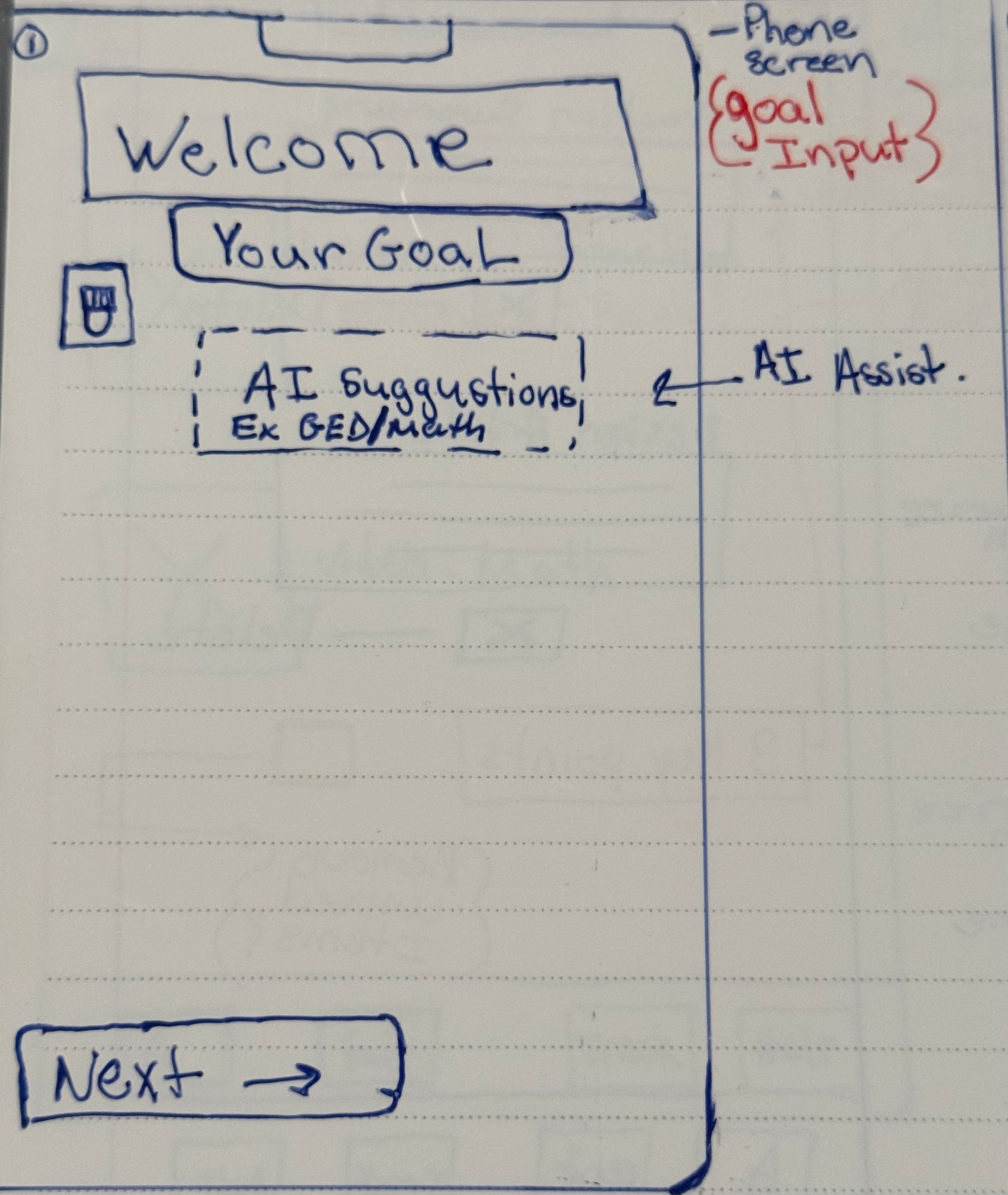
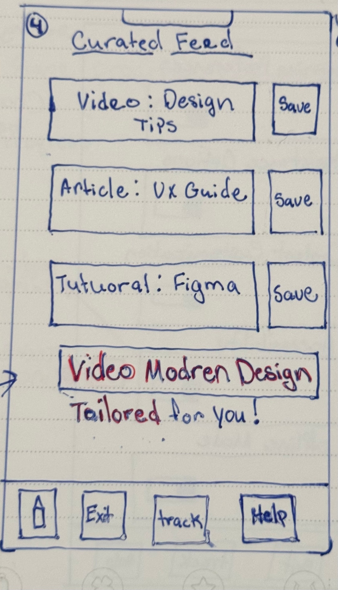
Iterating through two different starter frames to determine the most intuitive layout. Focus was on clear entry points — a welcoming onboarding flow with goal-setting and AI suggestions, followed by a curated feed of saved and tailored resources.
Frame A
Frame B
Iteration
Simplifying the Navigation
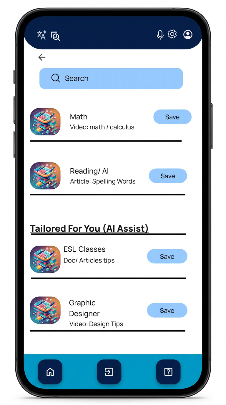
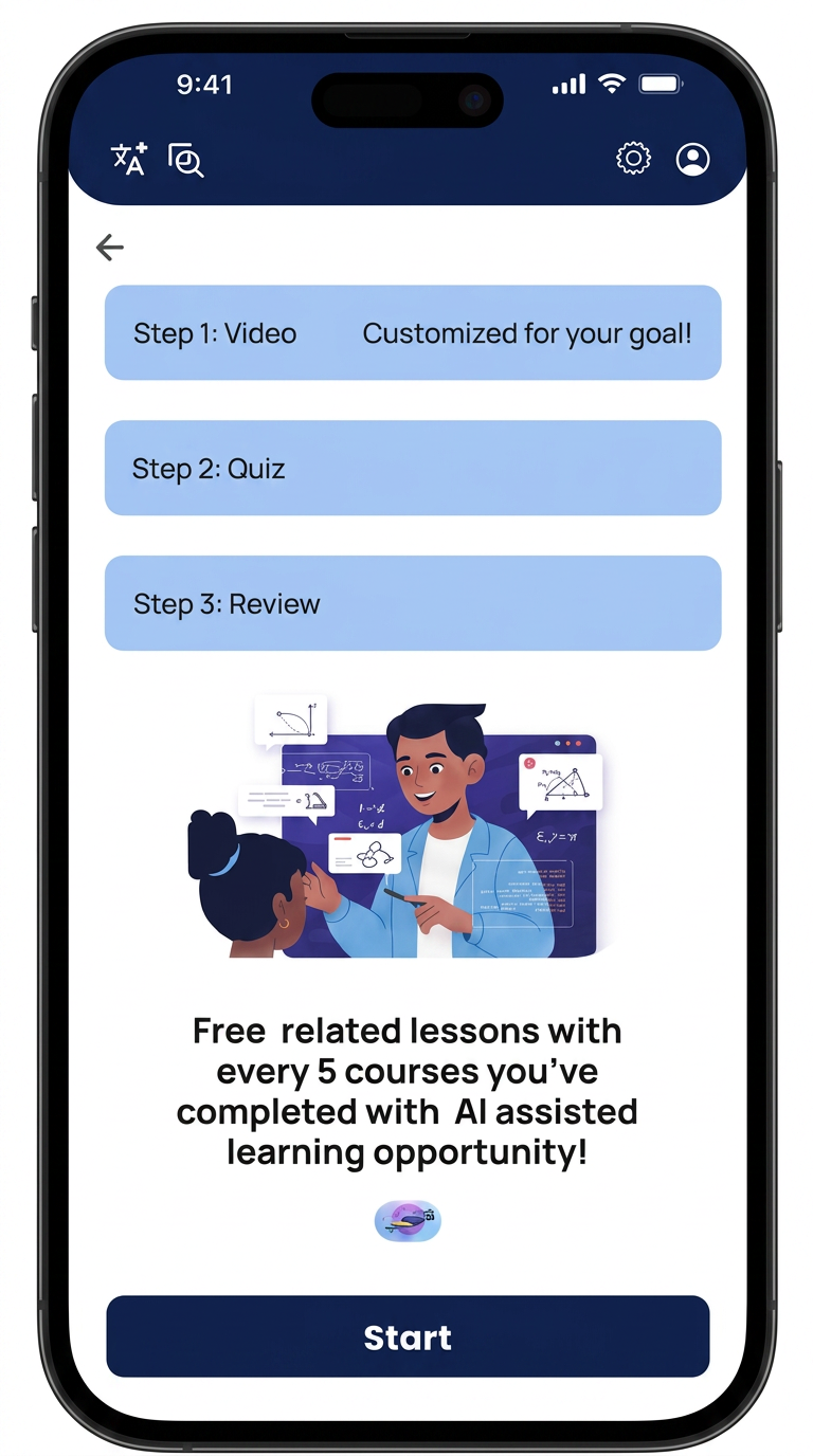
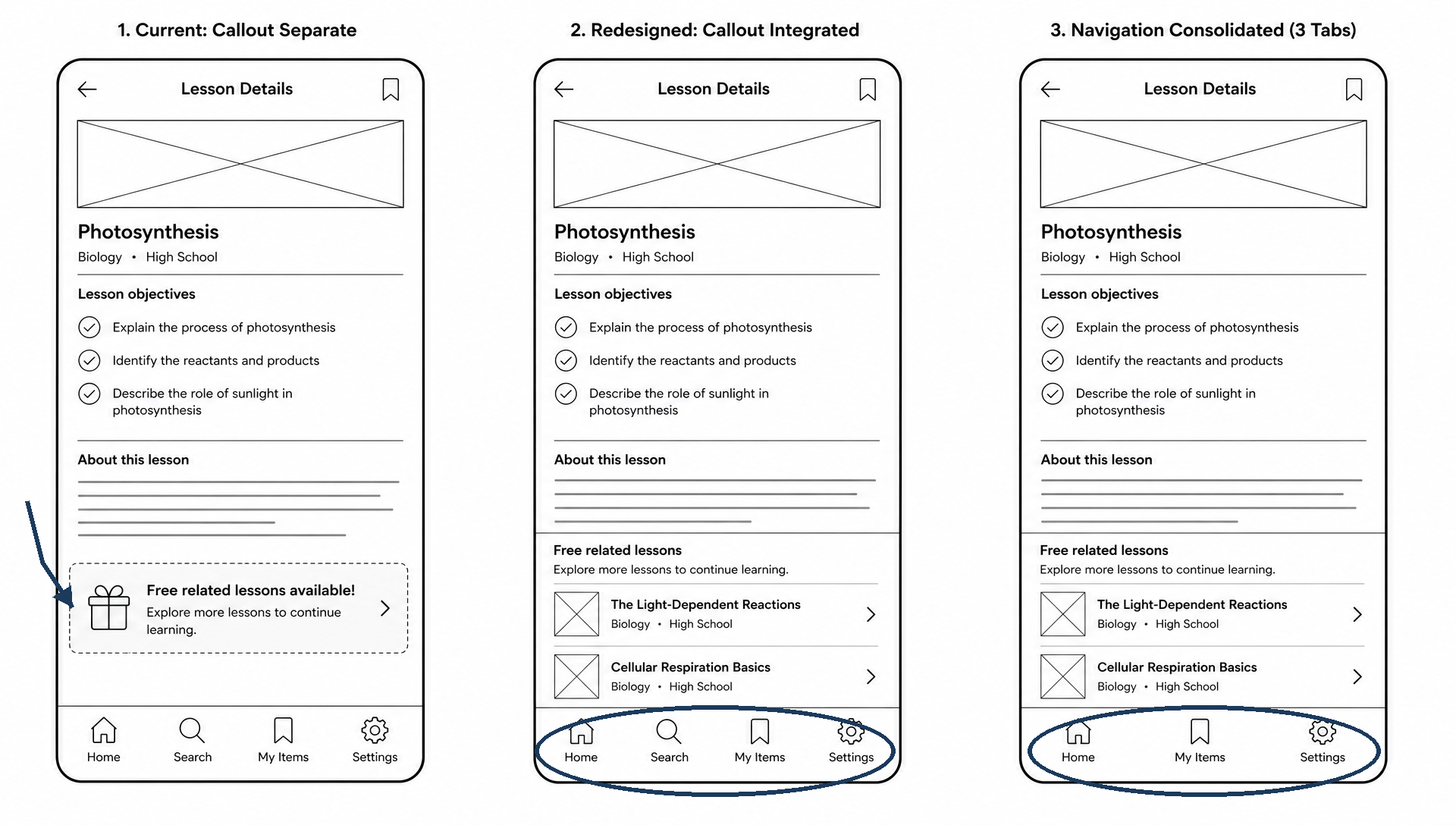
Consolidated menu reduced from 4 icons to 3. Merged Saved Items and Processing to eliminate clutter. Added Free Related Lessons prompts to address the pain point of costly educational plans.
Testing
The Reality Check: Usability Findings
Round 1
Accessibility
Users needed voice feedback for actions. Visual focus points were too weak for eye impairments and needed thicker lines.
Round 2
Interaction
Buttons were too small causing accidental clicks. Users explicitly requested a language option in settings.
Usability testing revealed that busy backgrounds were creating eye strain. One accessibility-driven decision changed everything.
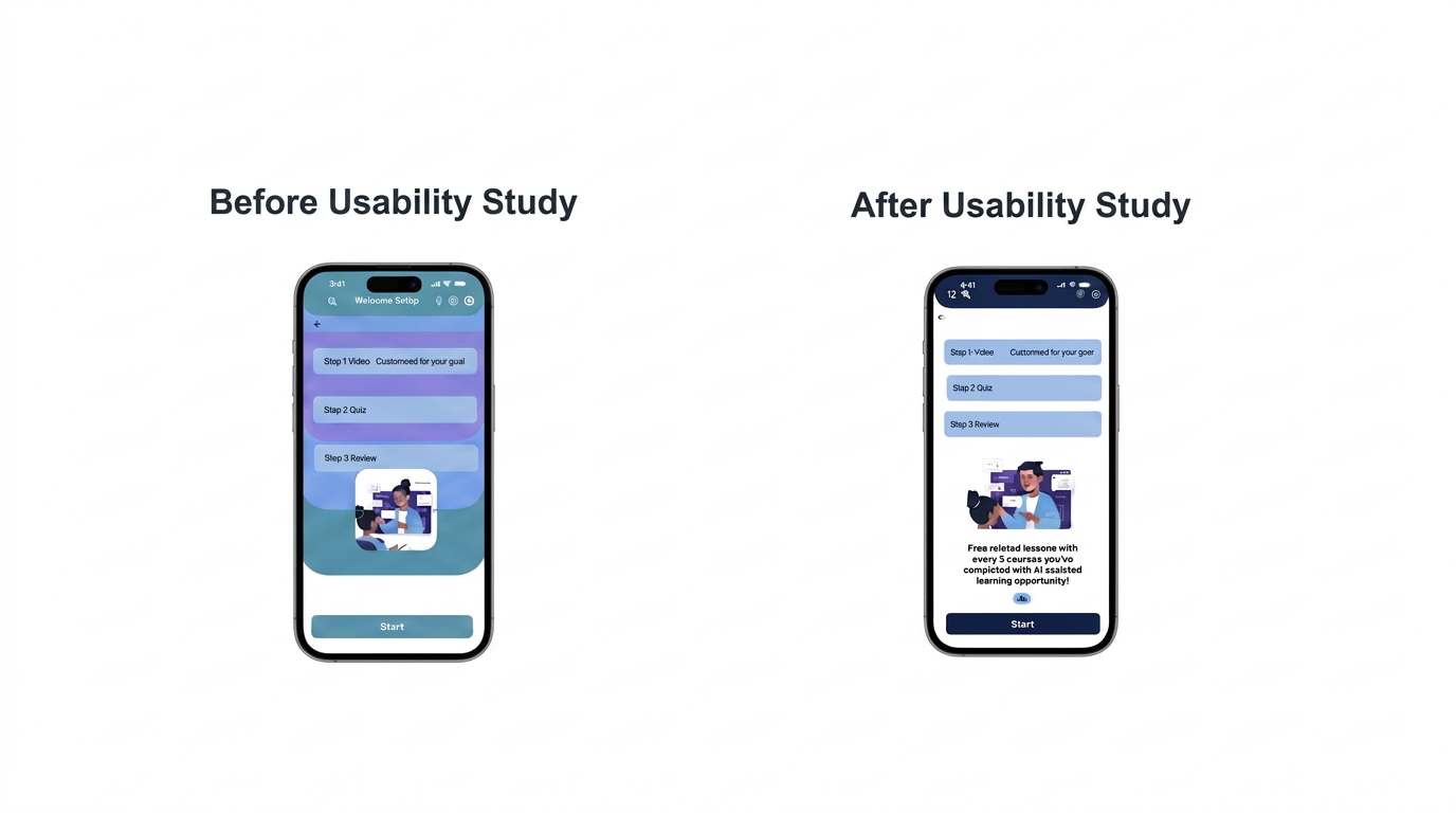
Pivot: I removed the background colors for accessibility reasons, leaving a clear white background. It creates less strain on the eyes.
High Fidelity · Journey · Inclusive Design
The Experience — Accessible by Design
Screens that earned their place
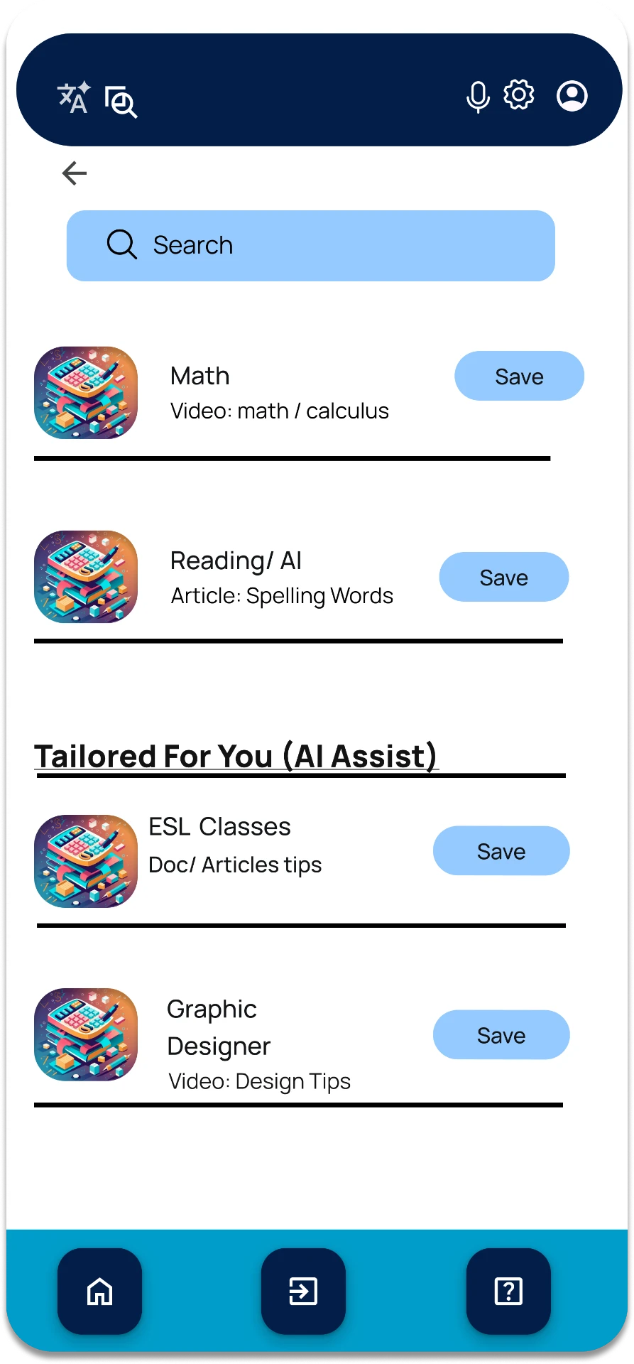
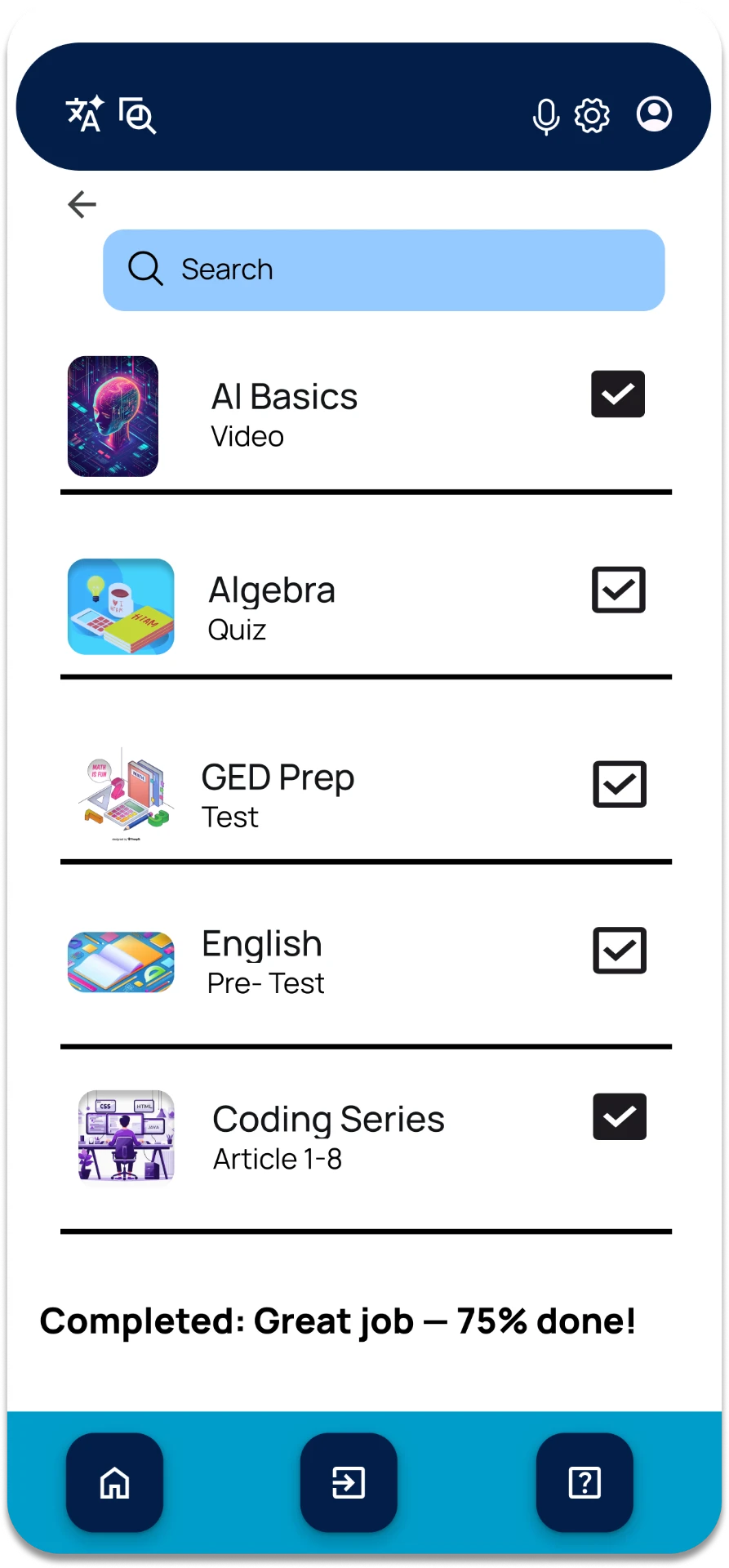
A seamless flow that prioritizes intuitive navigation and clear presentation of critical information.
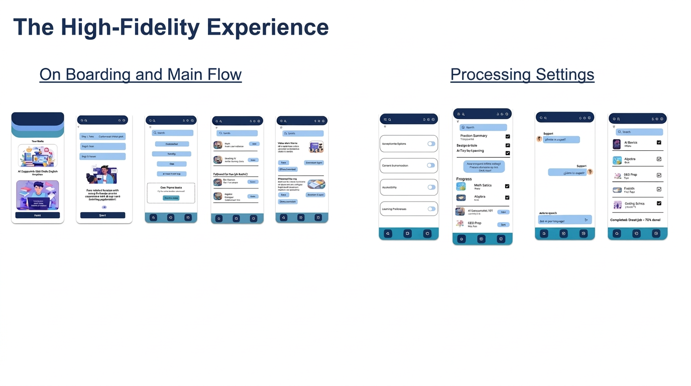
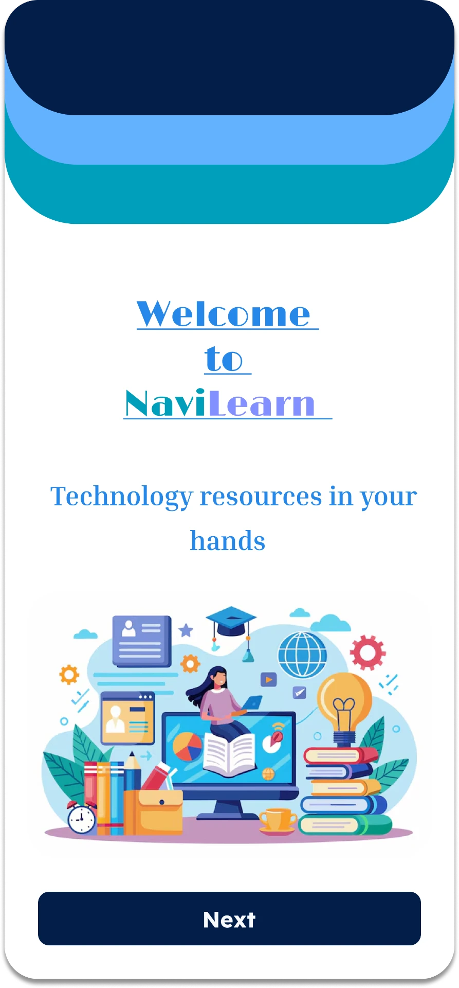
Featured Onboarding Screen
Mapping the User Journey
Designing for every user
Accessibility built into the header — not bolted on as a settings toggle.
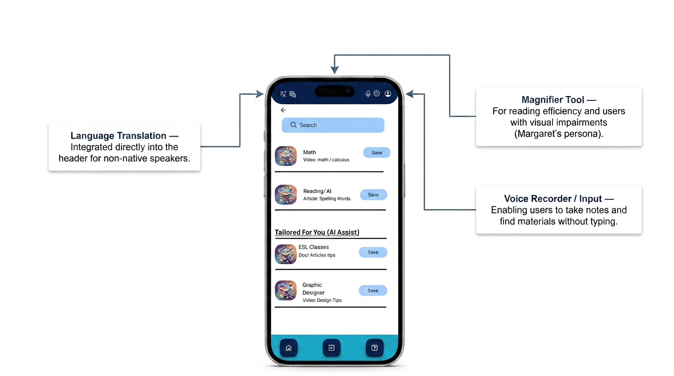
Language Translation
Integrated directly into the header for non-native speakers.
Magnifier Tool
For reading efficiency and users with visual impairments.
Voice Recorder / Input
Enabling users to take notes and find materials without typing.
Why Accessibility Lives in the Header — Not a Settings Menu
Research showed that users with low tech fluency rarely dig into settings menus. If accessibility tools were hidden behind a toggle, the people who needed them most would never find them. Putting language, magnifier, and voice input one tap away in the header made inclusion the default — not a feature users had to discover.
Outcome
Impact & Key Takeaways
Impact
Users reported increased ease in studying and note-taking. Accessibility features notably improved the study experience. Validated the mobile-first approach as many users rely exclusively on phones.
What I Learned
Users face prevalent difficulty accessing efficient study materials. Prioritizing user insights over assumptions was crucial to solving the digital divide.
Roadmap
Reflections & Future Directions
This is a UX concept project. The following represent design thinking about how this product could evolve if built.
If developed: Beta Launch
A real-world beta with 50 users would validate engagement patterns discovered in usability testing and surface edge cases not captured in prototype testing.
If developed: AI Integration
Personalized learning resource suggestions and curated paths based on user behavior would directly address the time constraint barrier identified in research.
If developed: Wellness Features
Study timers and mental break prompts would support the burnout prevention needs raised by participants in Round 2 testing.